

Project Preview
A tech company specializing in building websites, web platforms, and digital solutions with a focus on clarity and performance.
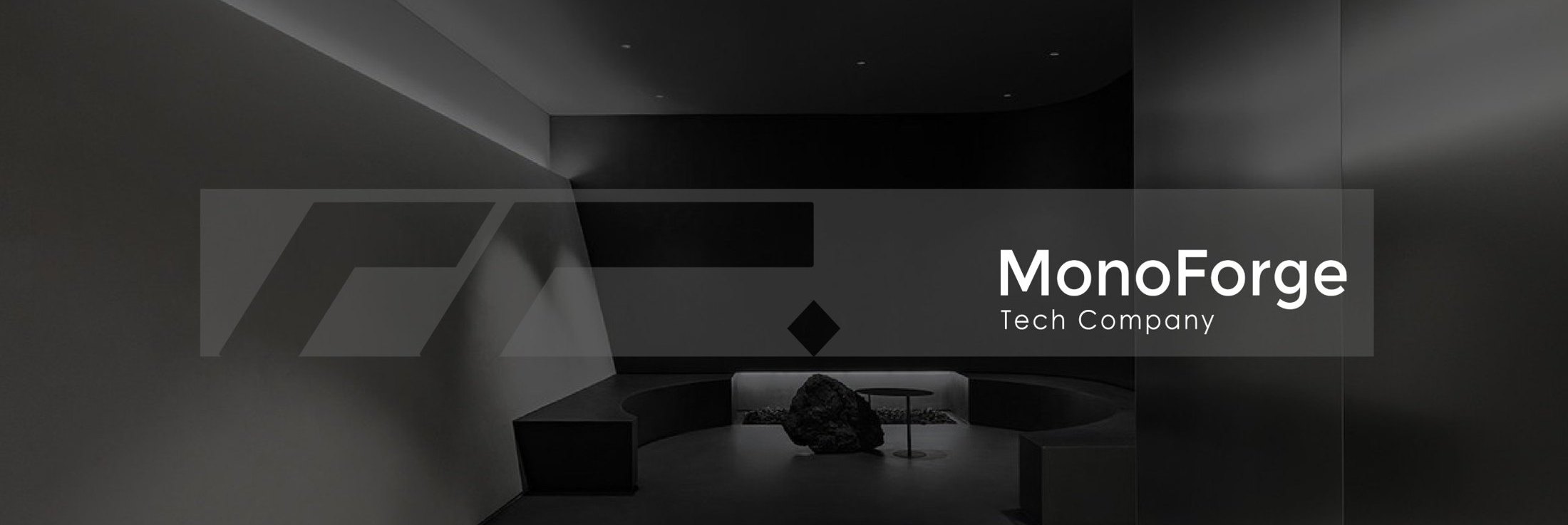
The name “MonoForge” combines mono, reflecting the monochrome palette and a focus on singular clarity, with forge, symbolizing the process of building from the ground up. This fusion shapes a timeless visual identity, minimal yet bold. The design avoids distractions, allowing the brand’s core message and digital functionality to stand at the forefront. Whether applied to interfaces, print, or motion graphics, MonoForge maintains a sharp, cohesive presence.
Logo Idea
Logo Grid
Typography
- Capital letters
- ABCDEFGHIJKLMNOPQRSTUVWXYZ
- Lowercase letters
- abcdefghijklmnopqrstuvwxyz
- Numbers
- 1234567890
- Capital letters
- ABCDEFGHIJKLMNOPQRSTUVWXYZ
- Lowercase letters
- abcdefghijklmnopqrstuvwxyz
- Numbers
- 1234567890
Color Scheme


Brand Collateral
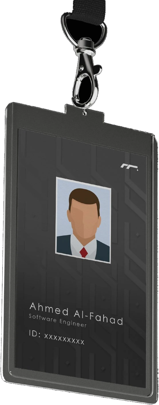
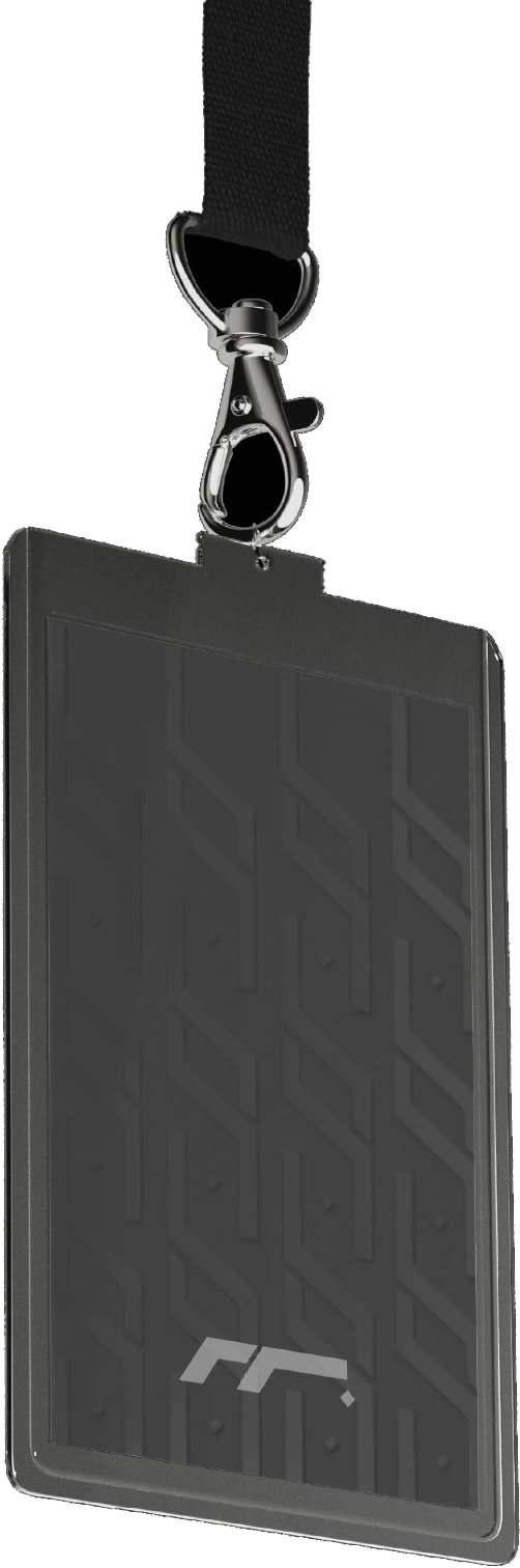
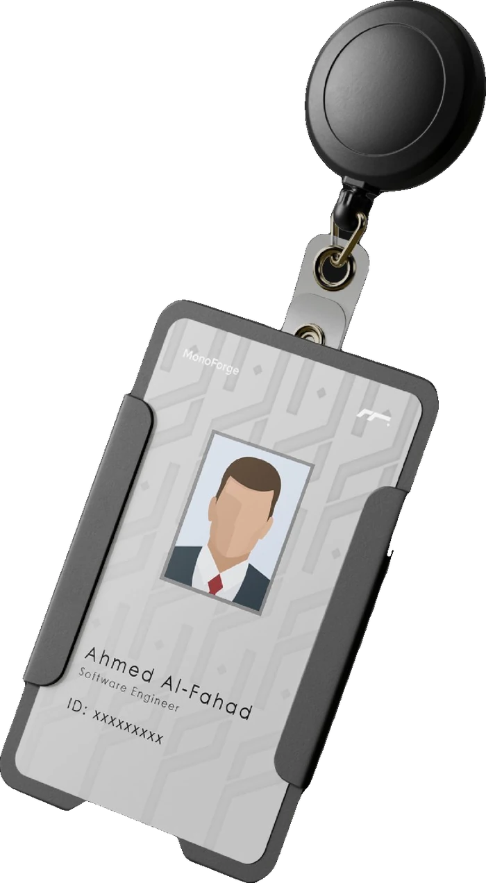
Employee ID badges and office stationery, all following the brand's monochrome colour palette.
- ID Badges
- Two types of employee ID cards: black and white
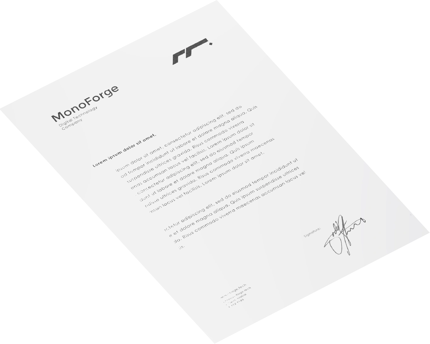
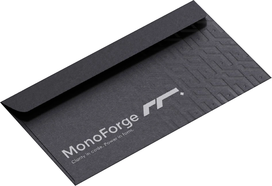
- Stationery
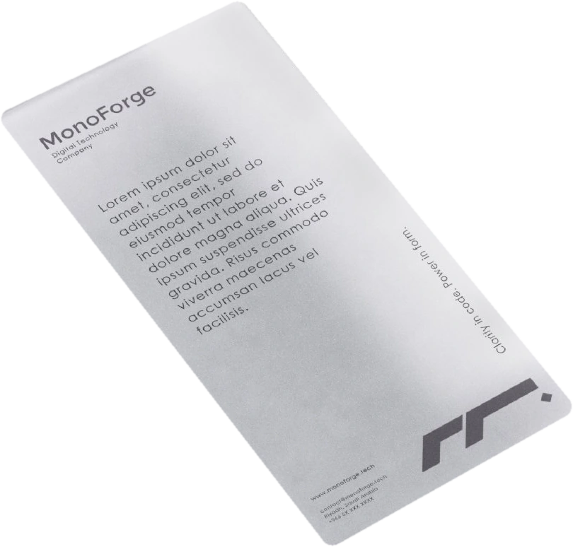
- Letterhead, envelope, business cards and a frosted sheet
Billboards
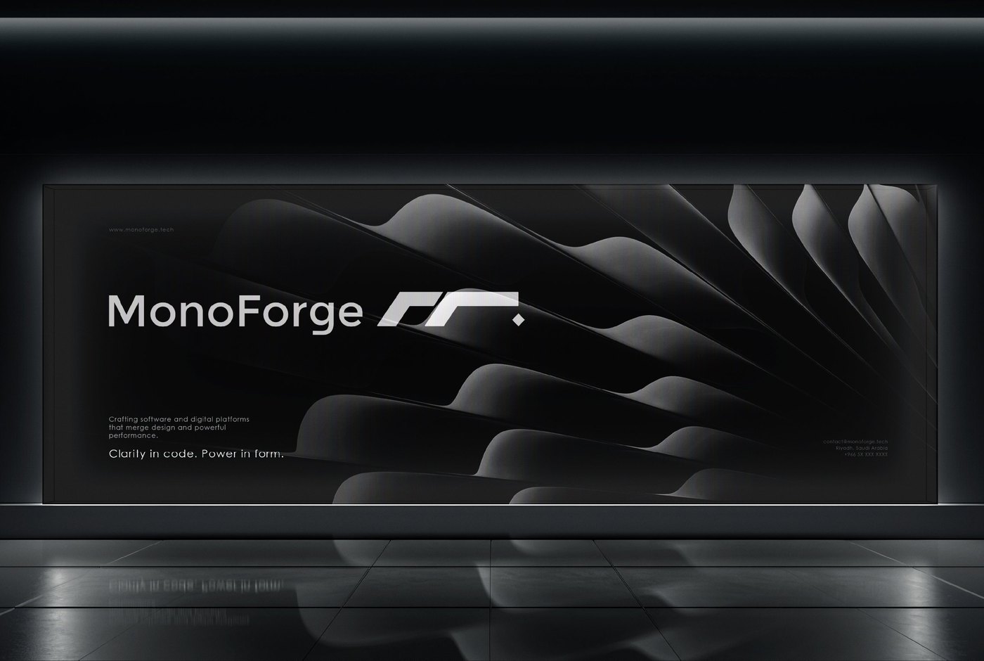
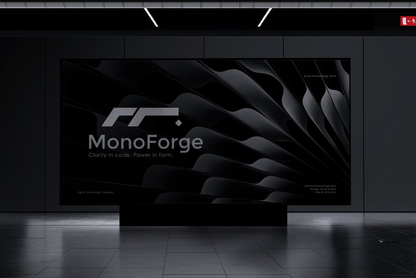
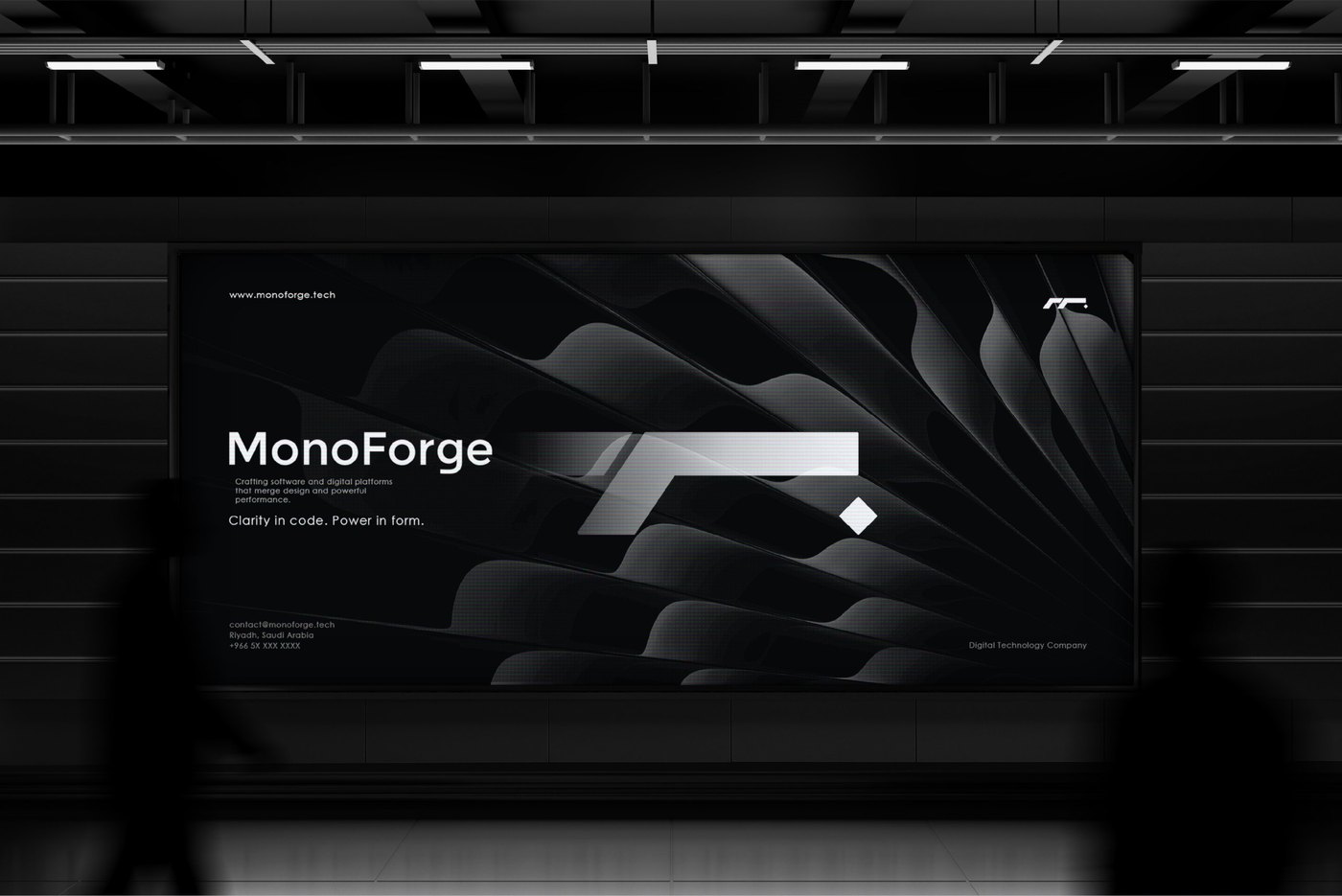
Three billboard designs for public spaces.
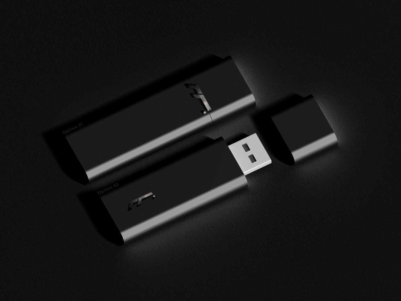
Tech Accessories
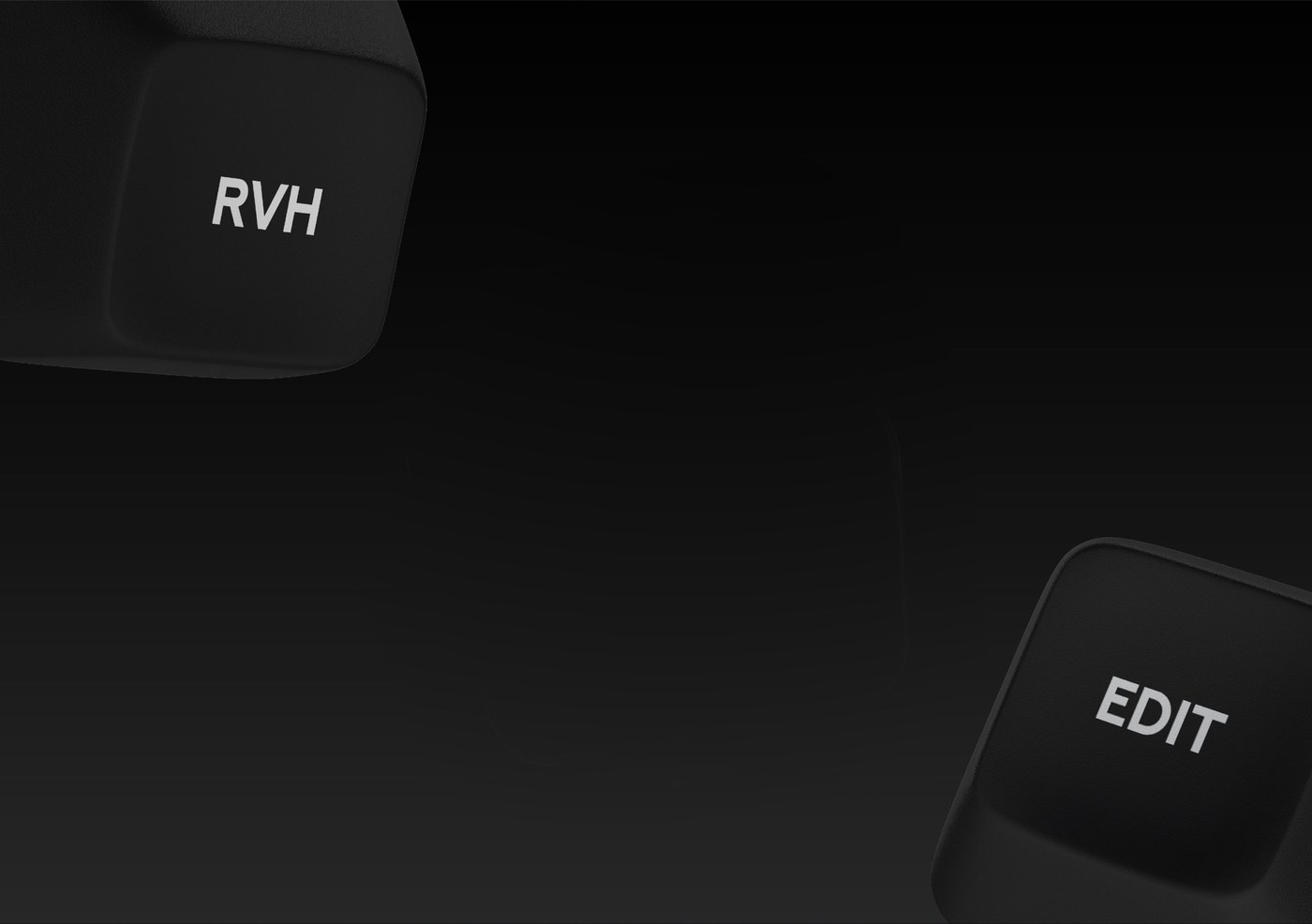
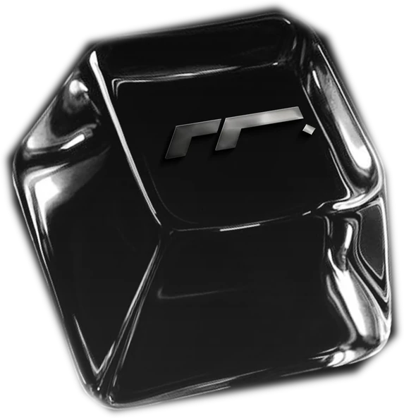
A USB flash drive in two options and a keyboard keycap, both carrying the MonoForge mark.
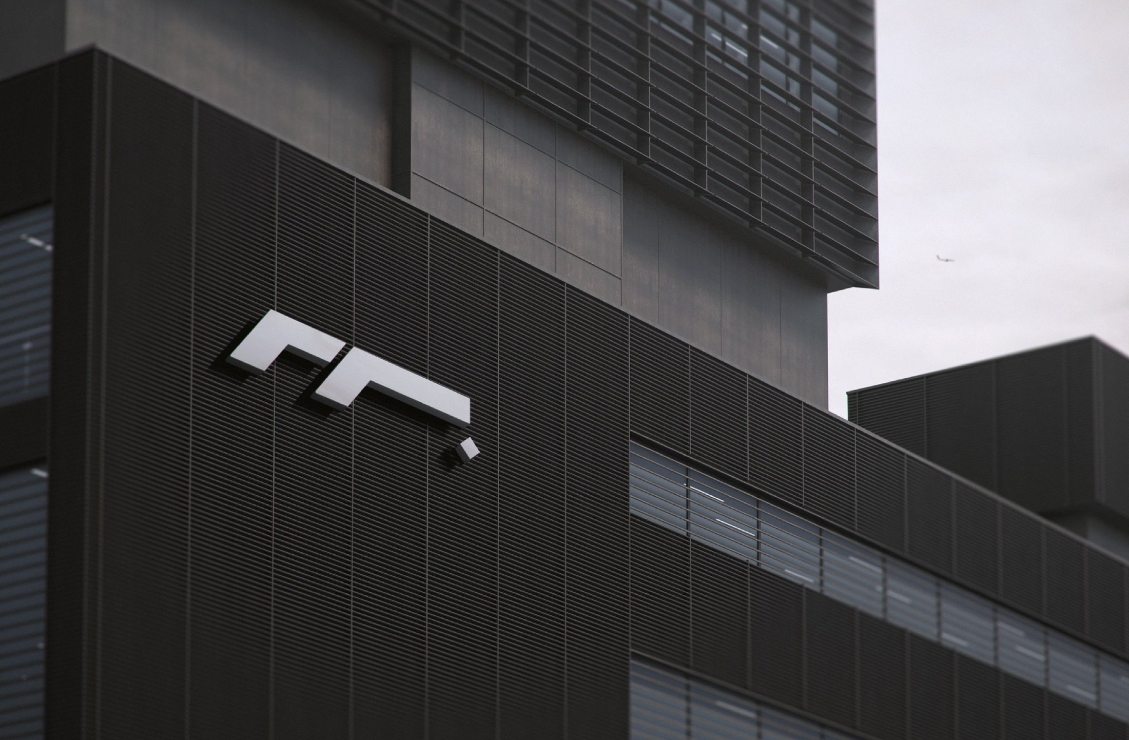
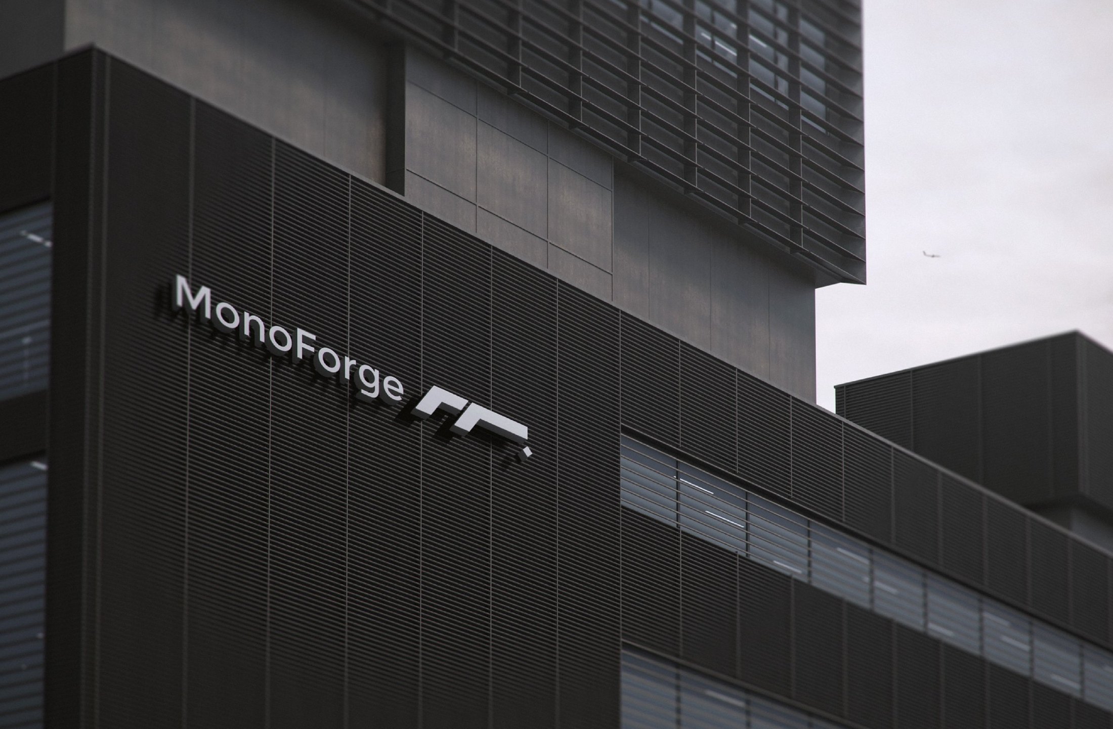
Building Signage
The mark on the building façade in two versions: the full logo with the wordmark, and the symbol on its own.